

A new decade is just around the corner! Pantone and major paint brands have announced their 2020 color of the year, and we're helping you bring these trending hues into your home.
Benjamin Moore - First Light
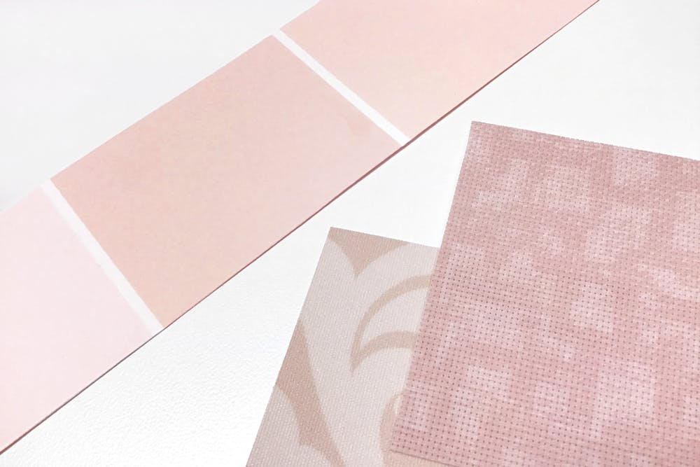
- A soft, warm pastel pink. Very rosy.
- It's comforting and uplifting color
- Subtle and not overpowering
- Pair with a traditional neutral like beige or grey to ground your look
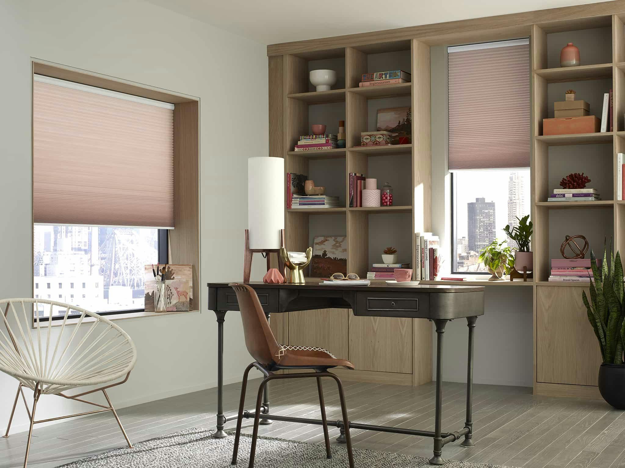
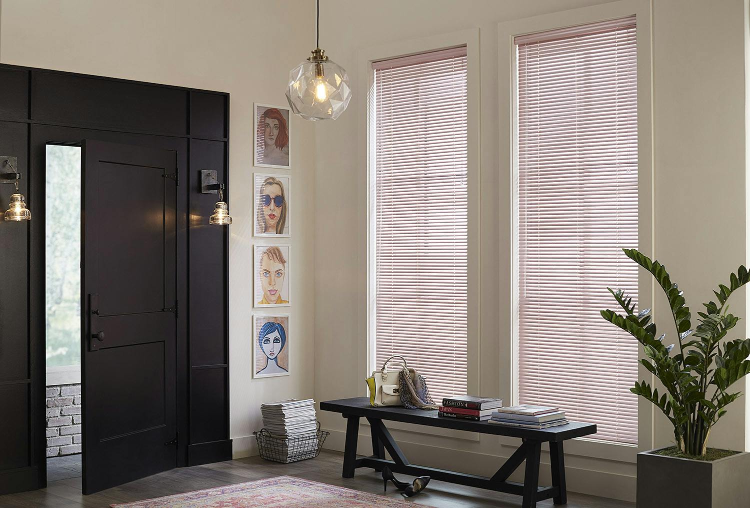
Try this look on your windows with the Economy Light Filtering or Blackout Cellular Shades in Dusty Rose (pictured below). For a more muted tone but still inspiring try the Blinds.com Light Filtering Roller Shades (also in Blackout) in Damask Beige. Try a modern feel with the Blinds.com 1" Mini Blind in Pale Pink.
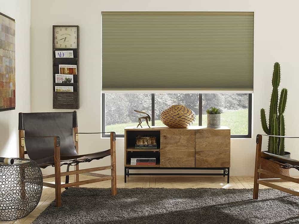
Behr - Back To Nature
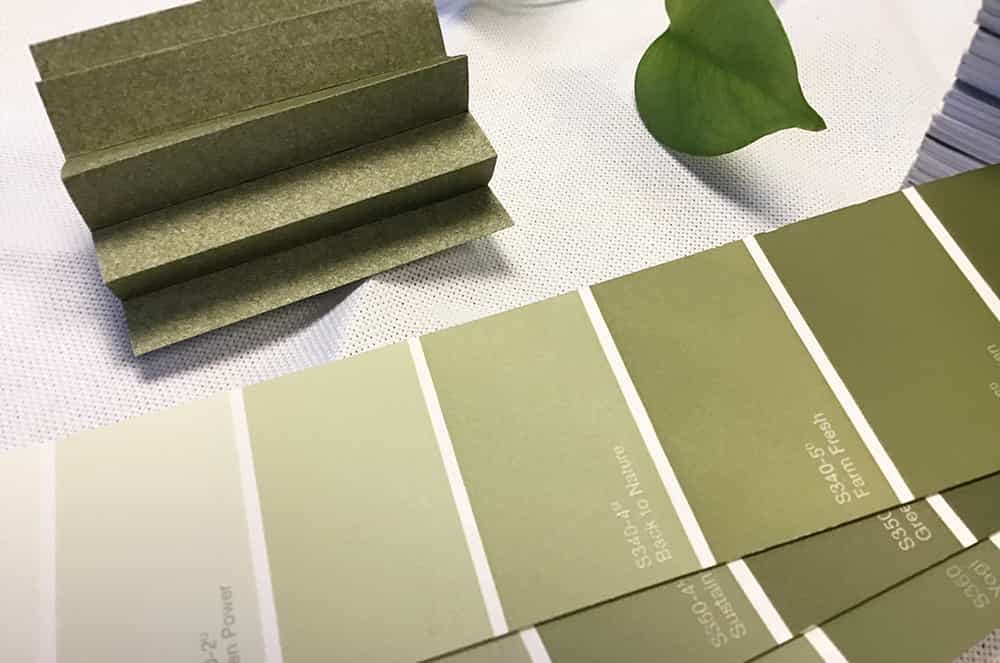
- A pastel, light sage green
- Inspired by nature and the spirit of discovery
- Pairs nicely with browns and pinks!
- This pastel is a calming and grounding color
Bring a little nature to your windows with an inspiring color like Olive Moss in the Economy Light Filtering or Blackout Cellular Shades (pictured below).
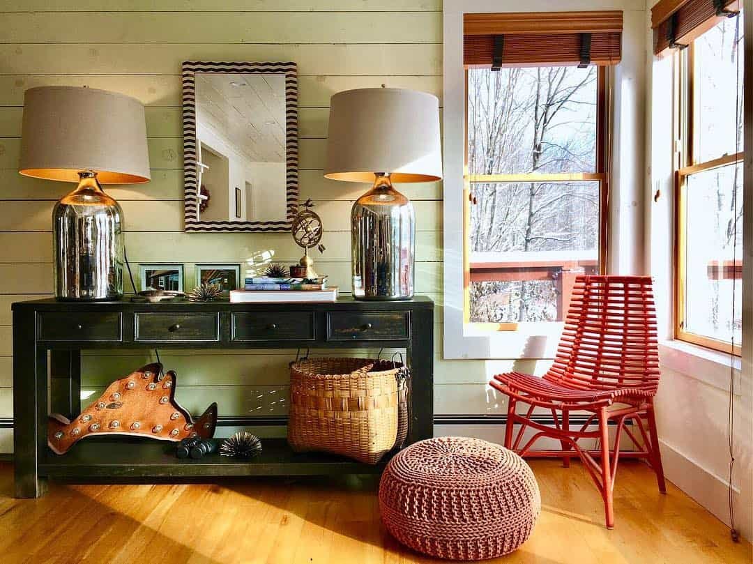
Or complement the green in your room with a wood tone like the 2" Architectural Wood Blind in Copper (pictured below).
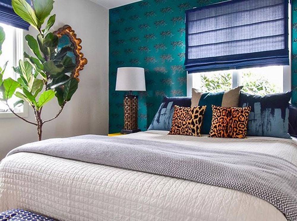
Sherwin Williams - Naval
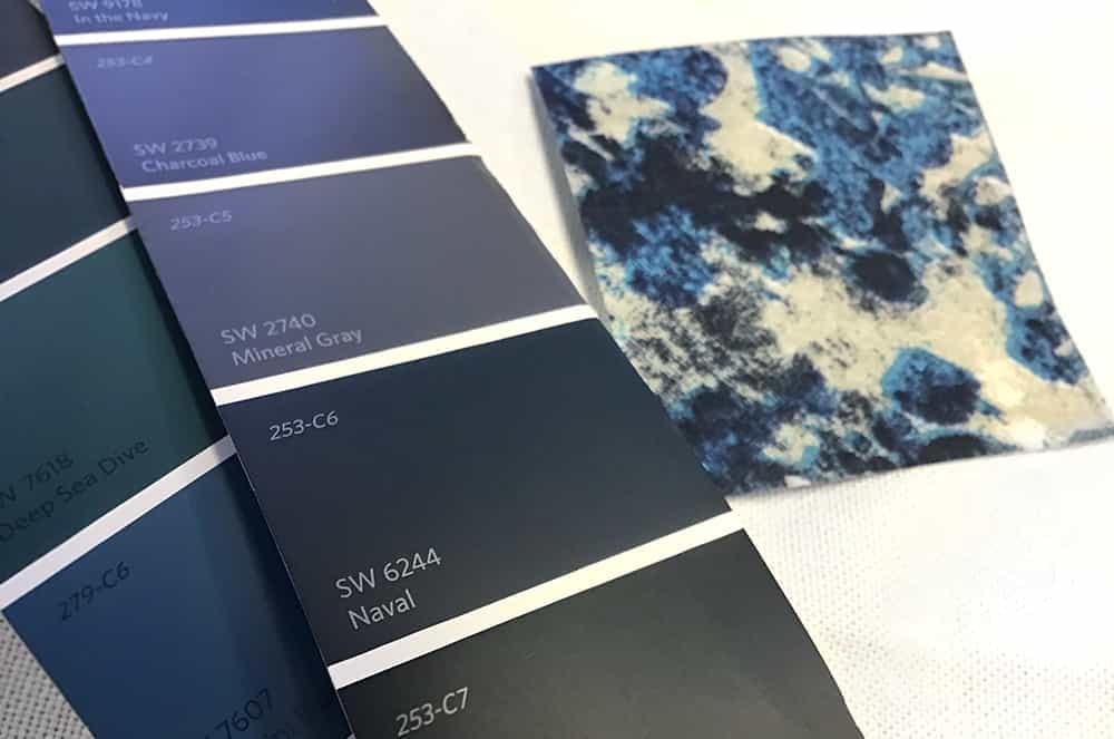
- A rich, neutral toned navy blue
- Pair with metal accents like brass for an updated art deco feel
- Inspired by the sea and sky
- A deep blue like the indigo dyes used in batik
The Blinds.com Designer Roman Shade in Camden Dark Storm is such a versatile color. It's a perfect shade of navy to ground light and airy spaces while adding a pop of color that isn't overpowering. For a bigger statement, try this navy hue in a pattern like Abstract Blue Mountain from the Blinds.com Premium Light Filtering or Blackout Roller Shades.
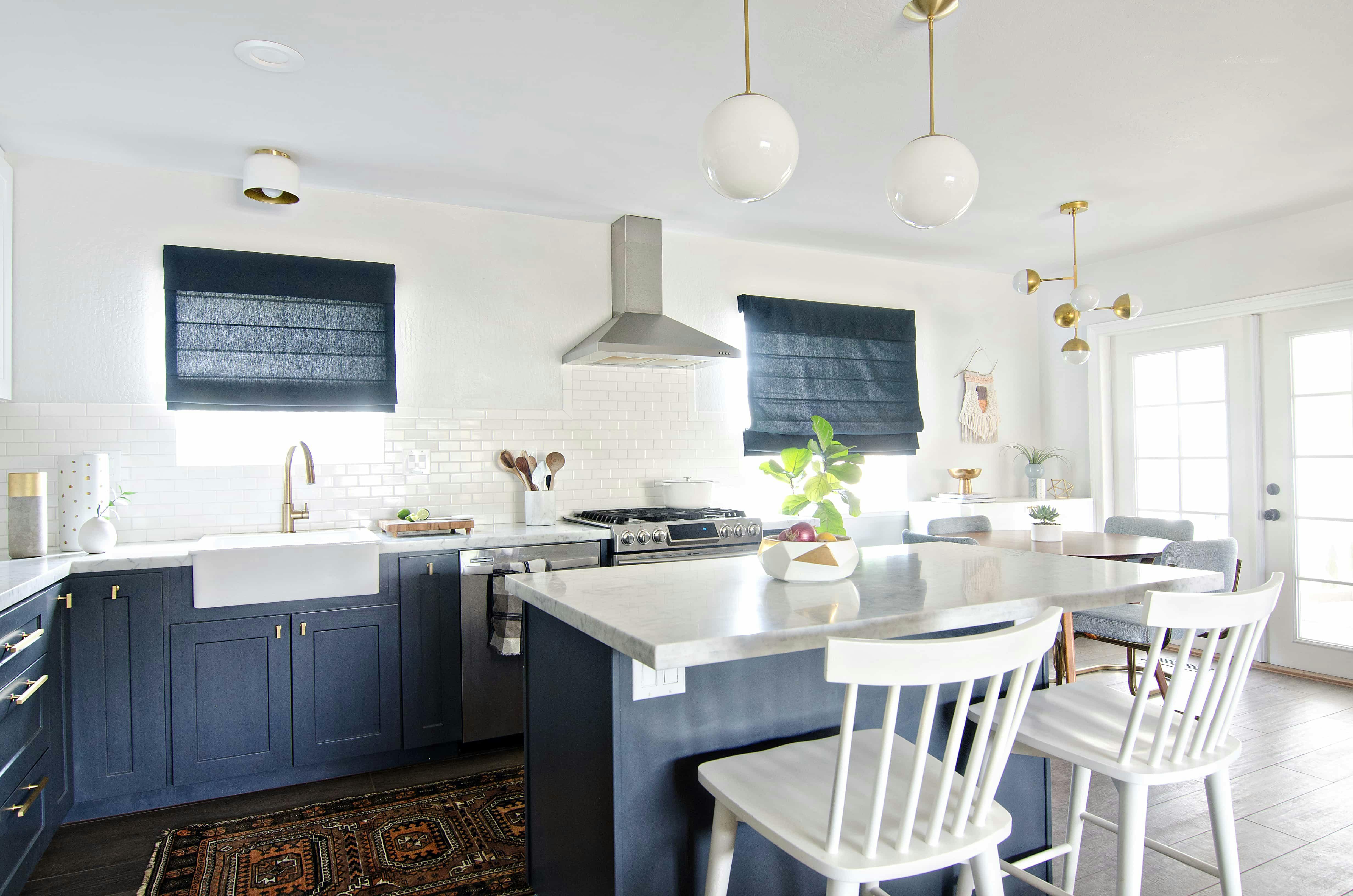
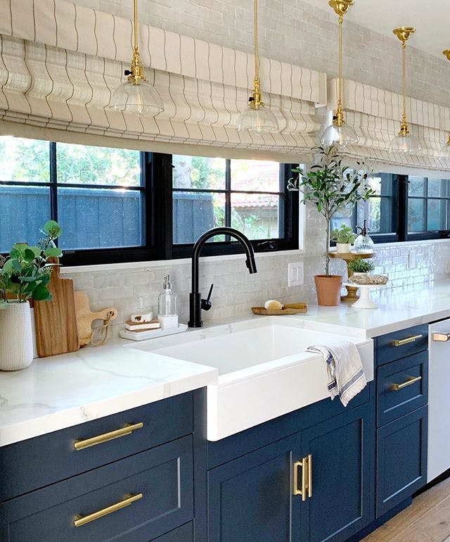
Match blue tones in your room with a more traditional neutral like the Blinds.com Premium Roman Shade in Linen Stripe Vanilla-Stone like @kismethouse did in her kitchen!
PANTONE - Drumroll Please!
The color for 2020 is.... CLASSIC BLUE.
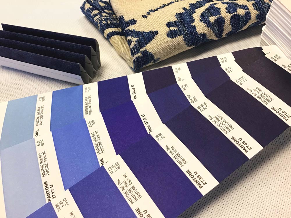
- Deep, velvety like a starry night sky or calm ocean waters
- Peaceful and serene
- 11 years since a blue this rich and pigmented has been chosen
Blue is so big right now, it's made it onto our list twice (we're particularly fond of this "Blinds.com" blue shade ourselves).
Historically, Pantone looks to nature for its inspiration. Classic Blue is a reflection of the evening sky as it transitions to night. We've seen this color popping up everywhere in home decor and fashion. Classic is a great way to describe it.
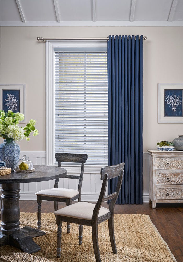
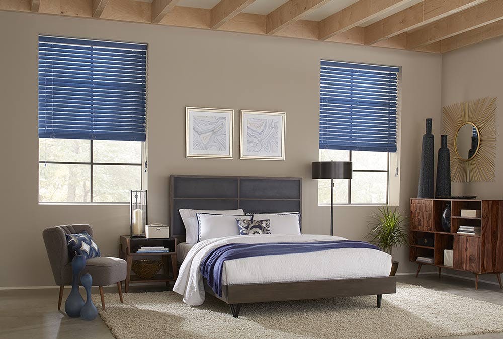
This color works great on window treatments. It's bold and bright without being flashy and is a great way to bring a bit of color to your home while still complementing surrounding decor. To bring this look to your windows, checkout the Blinds.com Easy Grommet Drapery in Hamburg Starry or Blinds.com Premium Roman Shades in Rio Atlantic. For a tilt-able blind try the Blinds.com 2" Room Darkening Fabric Blind in Blueberry.
Need a Color Consult?
Our expert Design Consultants are available to help answer all your questions, send you free color samples and be a sounding board for all your window design dreams! Give us a call at 844-551-3769!
Need help with measuring or install? We've got you covered with our professional measure and install service!