

Did you have a mood ring growing up? Did you ever play with it hoping to get it to stay a particular color because of what it said about you?
People have been obsessed with color meanings and psychology since long before the age of the mood ring, dating back as far as ancient Egypt. Today, color theory and meaning is an important part of art education and the design industry. Every year Pantone and major paint companies create a lot of chatter by announcing a new "color of the year".
What do you think? Do our color associations really have a strong, tangible effect on our mood, behavior and well being?
How Does Color Psychology Work?
A lot of color psychology is speculative, simplified and ultimately more research is needed. Plus color interpretations can vary from location to location. For example, people in cold climates tend to prefer warmer colors, while people in warmer climates prefer cool colors. Personal experiences like strong memories and color blindness can influence your perception of particular colors.
While it may not be based in hard science, color psychology can be interesting to consider before planning your next room makeover.
Tickled Pink
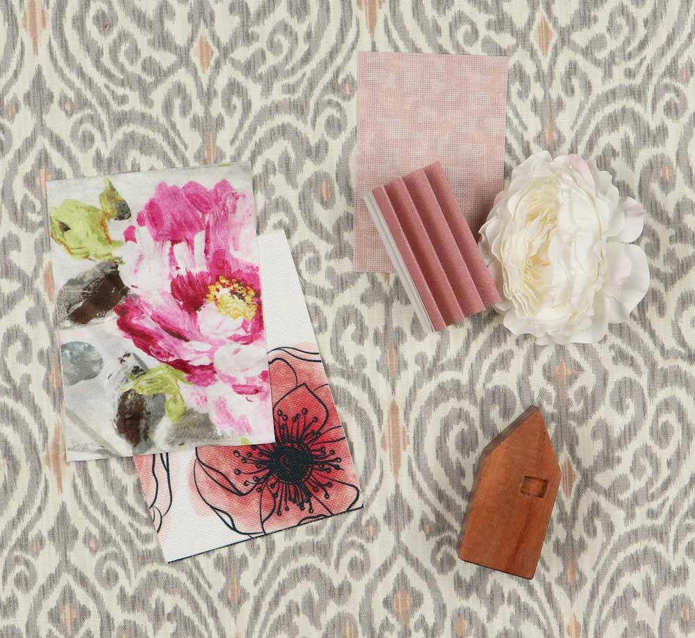
Since 2012, rosy pink tones have been rising in popularity, and are no longer reserved for children's toys! From millennial pink to rose gold, pink has conquered the decor and fashion industries. It gives off a lively and healthy glow that's universally flattering. Lighter blush tones function like neutrals, so they can be a great decorating alternative if you're sick of beige. Pops of pink in an entryway or office are be a fun way to make a space feel fun and welcoming.
A particular shade of pink was shown to lower aggression in prisons initially, but long term exposure was attributed to increased aggression. Because of this and other studies, pink has been viewed as an overstimulating color.
Paint The Town Red
Red is the epitome of a warm color because of its association with fire. Its warmth can make it a welcoming color for home decor (think classic red front doors). And in many instances, red is used to symbolize love and passion.
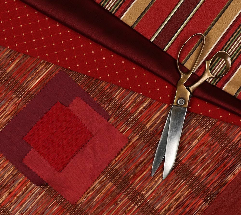
It's a popular choice for restaurants, kitchens and dining rooms because the hue has been shown to stimulate appetites. Theaters also often decorate with red, like luxurious red curtains or red carpet, to give a feeling of grandeur. Try red drapery panels in your media room or home theater for an elegant looks that helps block glare on the big screen. Small pops of red in an otherwise neutral room can feel fun and energizing without feeling aggressive.
Will You Be My Clementine?
Orange is considered an extroverted color - even it’s pastel shades feel enthusiastic and flashy. It's a warm, tropical color that can reminds us of citrus or a setting sun. People who wear or decorate with orange often report feeling more confident. On the flip side, large quantities of orange can be overstimulating because of the added strain it puts on your eyes.
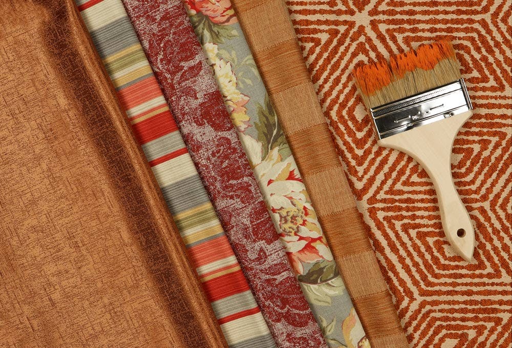
Orange isn't just reserved for decorating during pumpkin season! Pastel, peachy shades feel modern without the seasonal undertones. A burnt orange can bring vintage vibes when styled with mid-century or 70s styled furniture (the 70s are making a comeback)! Consider bringing this color into your office or workspace to foster your creativity.
You Had Me At Yellow
We’re told from childhood that yellow is the color of sunlight, so most people associate it with warmth, happiness and optimism. It's electrifying and, like red, stimulates the appetite. It's great for gathering spaces like living rooms because it's so friendly. Yellow is also sometimes linked to wealth because it is reflected in metals like gold and brass.
Surprisingly, there really isn't such a thing as "dark yellow"! When yellow is darkened it starts to turn brown which is why it works so well with wood accents. Many lighter woods, like oak, have a yellow tone. So incorporating sunny wood accents can make a room feel brighter too.
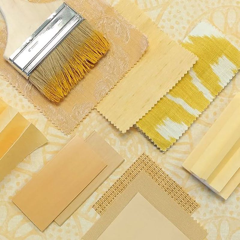
Despite yellow's cheeriness, many people list yellow as their least favorite color. Too much yellow can increase anxiety and make it difficult to relax, so it's best to keep this color out of the bedroom.
Is The Grass Greener On The Other Side?
Green is a versatile color and shows up in our daily language and expressions frequently. Perhaps most obviously, it reminds us of nature, so green has come to symbolize growth and sustainability. Green four-leaf clovers, leprechauns and money all lead it to be associated with luck and prosperity.
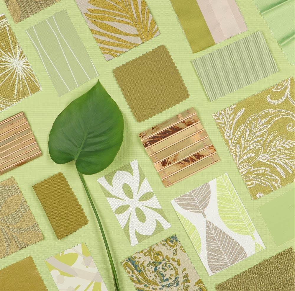
In decorating, green feels fresh and restorative. A great way to bring these qualities to your home is by keeping houseplants. Taking breaks to be exposed to nature has been shown to help decrease stress and increase productivity, so get a little more green in your life!
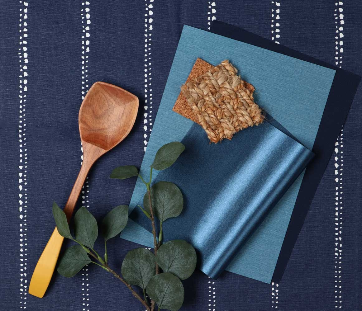
Out of The Blue
Did you know that prior to 1940 the color blue was associated with femininity? According to the Smithsonian, shades of blue were considered more dainty or prettier than pink in the early 1900s. Gender associations aside, blue is also most commonly linked with the sky and water, and thus a calming energy. Some studies even suggest it can help lower blood pressure. Light shades of blue are often used in spas to promote peace and reduce stress, so it's a great choice for bedrooms and bathrooms where you want to unwind at the end of a long day.
In 2020, Pantone announced Classic Blue as their color of the year, inspired by the color of the sky at dusk. Darker shades like navy, feel strong, dependable and professional. Blue is also the most popular "favorite color" in the world. We're particularly fond of Blinds.com blue ourselves. 😉
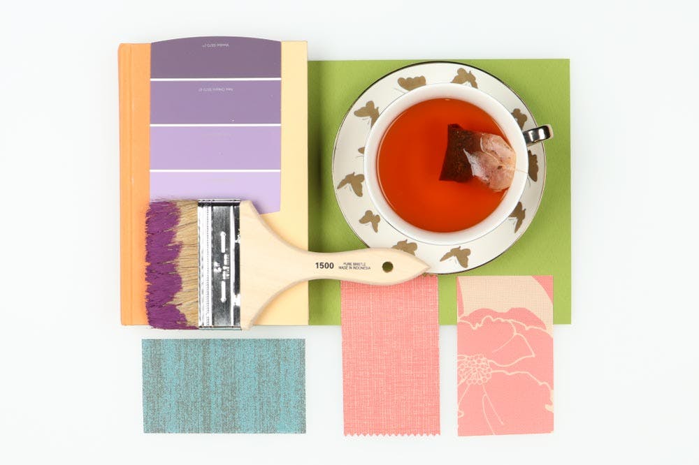
Plum Perfect
Historically, purple pigments were expensive and rare, as they could only be extracted from snails. In fact, in the 1500s Queen Elizabeth I declared only royalty could wear the color, and today we still associate purple with opulence and exclusivity. It's also not frequently seen in nature which adds to its air of mystery.
Many artists and creative types find purple inspiring. It is considered a cooler toned color so many feel it is a calming and relaxing color. Shades of lavender in the bedroom can even promote better sleep.
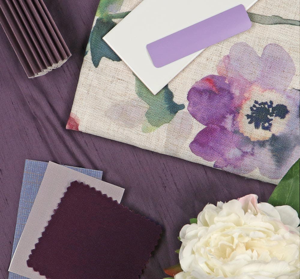
When decorating with purple, consider what other accents are in the room. Purple works especially well with cool-toned metals like silver or stainless steel. For a room that really packs a punch, pair purple with a contrasting color like a crisp white or bright green.
Purple can be difficult for the human eye to see and does not stand out like other colors, as it has the shortest wavelength. Some also see it as a childish or unconventional color. If you're drawn to more traditional hues, purple may not sit right with your tastes.
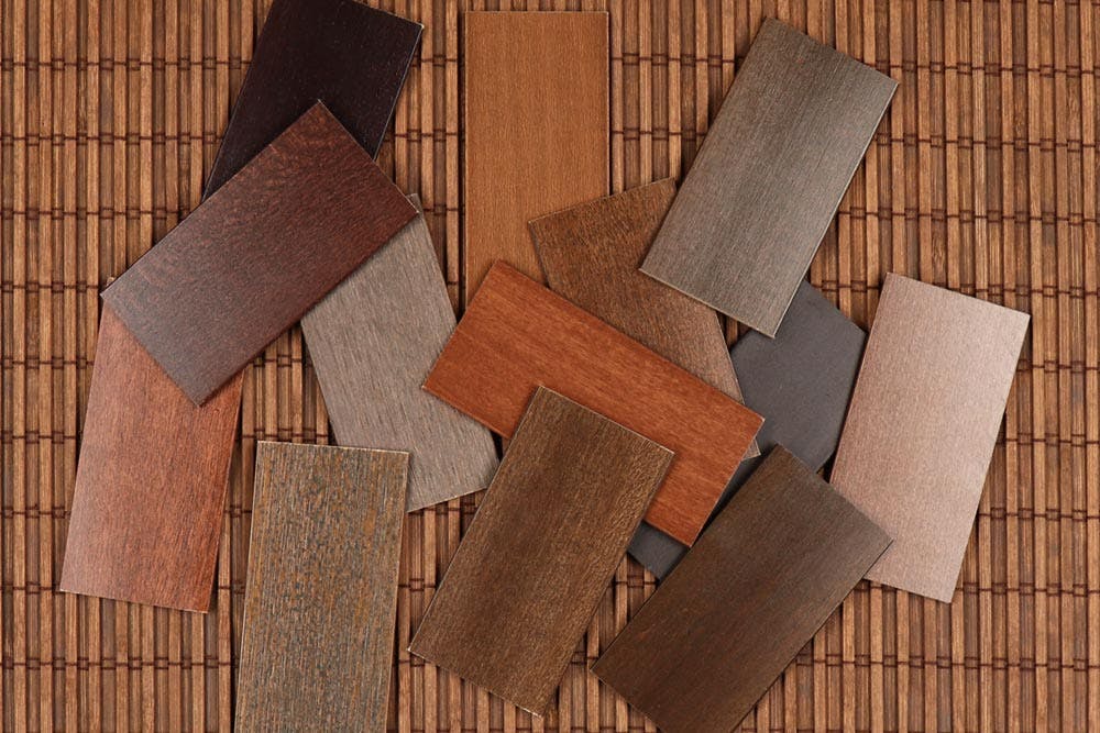
Down To Earth
It's no surprise that brown is considered grounding and earthy. We use it every day in wood furniture, flooring and even wood blinds and woven wood shades. Because of pervasiveness in nature, brown feels non-intrusive and can actually help us feel more connected to our environment. We associate it with reliability and trustworthiness. It's a humble color, never flashy and always orderly, so it promotes a feeling of security.
Perhaps it's wide use leads some to consider it unimaginative and a boring decor choice. People who don't like the color say it can feel uninspiring, dull and dirty.
On Taupe of The World
Beige is equally loved and reviled in the decorating world. It's rise in popularity due largely thanks to home-renovation reality TV. When these shows first launched in the 80s and 90s, they were focused on tips for selling a house. Beige was (and still is) considered neutral enough that prospective buyers or tenants can picture themselves living in a space and many feel it can improve on a home's value.
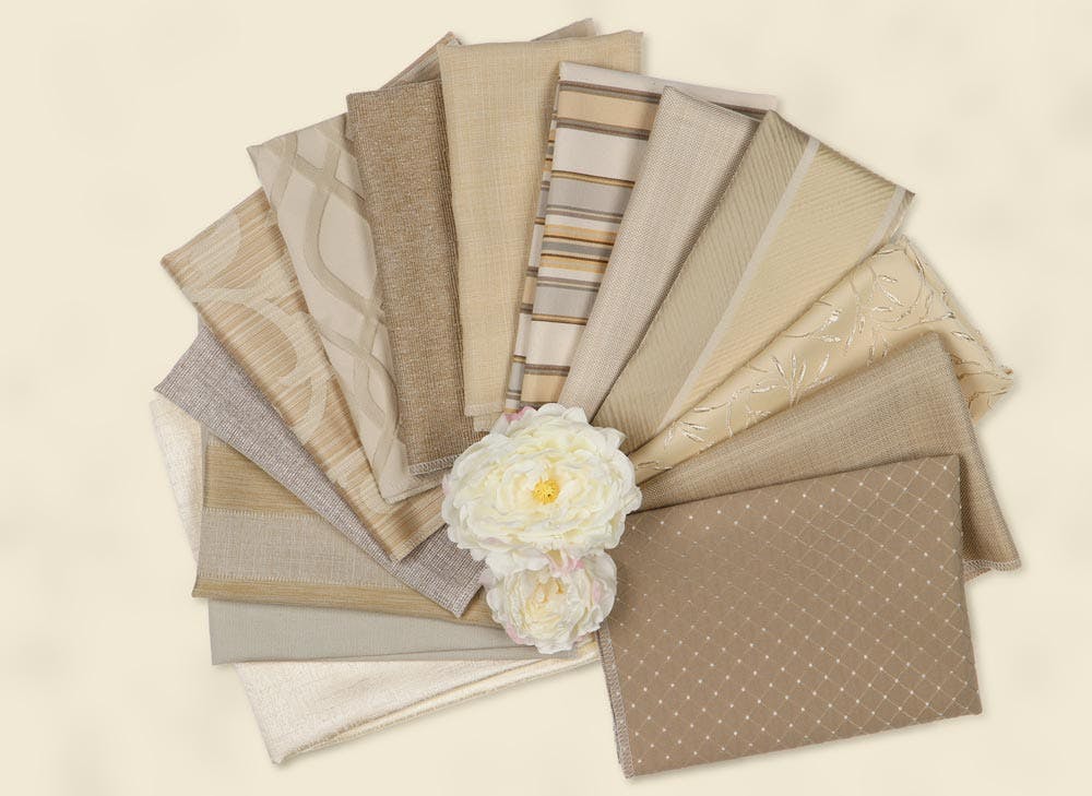
Neutral colors, by definition, have no strong defining qualities. Sometimes considered a light brown, beige combines the reliability of brown and peacefulness of white making it a flexible color. Because it is unassuming, beige is often considered relaxing and does not stimulate the senses the way a primary color does. It can feel clean and organic in the right light.
But there's a growing movement of people pulling away from the "all beige everything" rule in favor of more personalization with color choice being one of the simplest ways to express yourself. Beige does not grab your attention. Similar to white, it can feel sterile and basic.
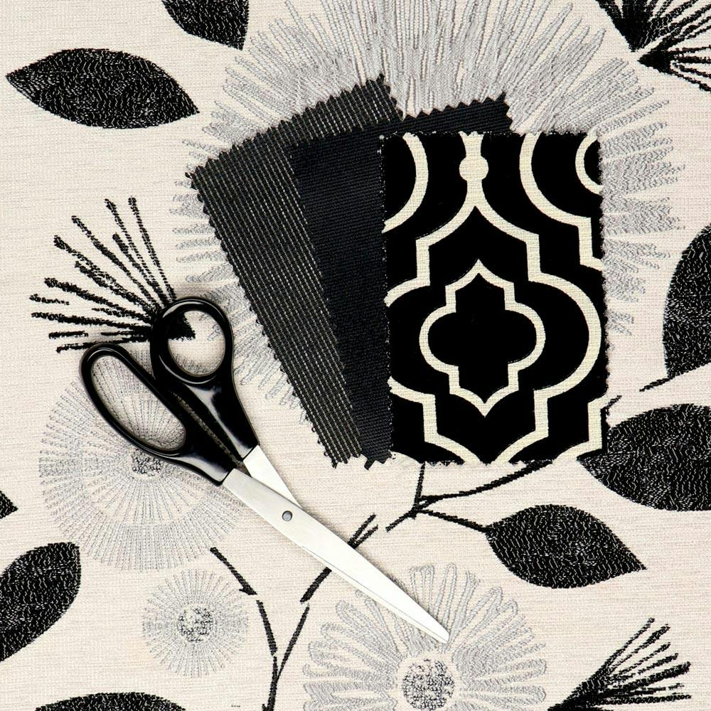
Back In Black:
Many debate whether black is actually a color, or the combination of all colors (because it absorbs all colors of light). Whichever way you fall, black is important in the world of color because it creates contrast and gives a feeling of depth. It's versatile and can fade to the background with ease or stand out against brighter colors making a bold statement. Like purple, we also associate it with luxury, power and sophistication. The "little black dress" and traditional black tux have been fashion statements for decades, but we're starting to see black gain popularity in the home décor world too!
It's interesting because it is always a dark "color" since it absorbs so much light. Some also consider this a dreary color because it is so dark. When decorating with black, it's best to incorporate it with other, brighter colors too.
Show Those Pearly Whites
The "is it really a color?" debate extends to white too! Technically speaking, true white reflects all colors of light and has no "hue," but when it comes to textiles there most definitely can be an undertone to white. On its own, white is often associated with hope and peace. It reminds us of fluffy clouds and can feel spacious or airy. It's also a home decor default - white is the most popular wall and blind color! It works with a variety of styles and easily fades to the background in decor.
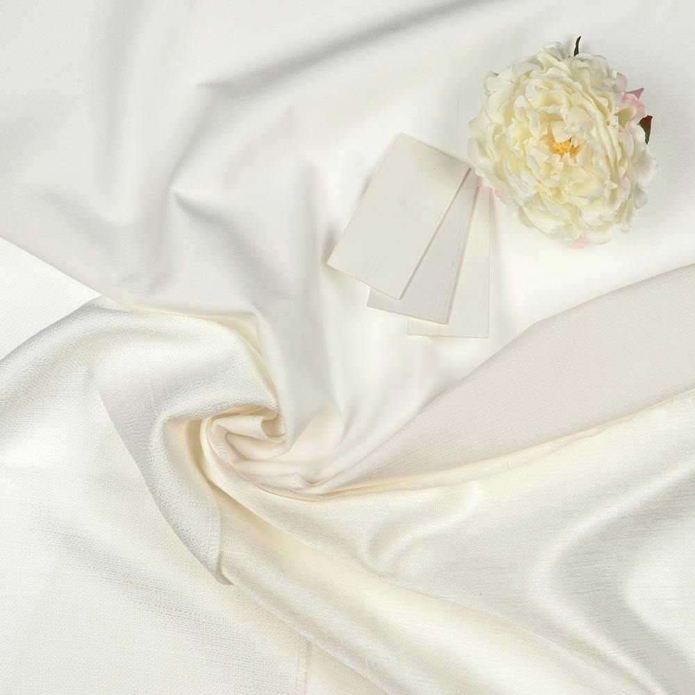
However, sometimes white can feel cold and sterile. Because it reflects so much light it can feel too bright and many consider it a boring default. It can make stains very visible and feel dirty if not properly kept clean.
A Grey Area
Bridging the gap between black and white, grey can help create a sense of balance. Lighter tones feel smoky, subdued and can have a calming effect as they do not overstimulate the senses. Silver and other metallic tones can feel sleek, elegant and formal in a mature way compared to the drama of black. Dark shades of grey convey strength and professionalism like a classic grey blazer. Grey distressed wood finishes are popular with farmhouse styles!
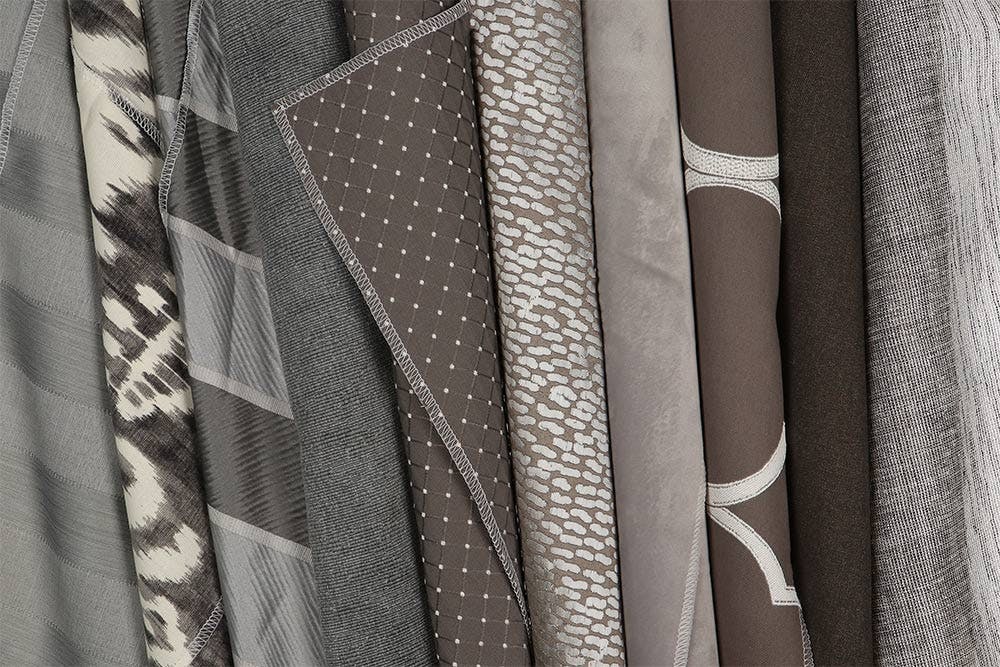
Grey started appearing as a home decor neutral several years ago. It started as a cool, refreshing alternative to the decades of "builder beige" we've been coating our homes in. But some are hoping this trend is on it's way out as grey can sometimes feel gloomy, serious and overly cold.
Need Help?
Of course, color and its' psychological influence goes a lot deeper than what we've covered here. There are no hard rules when it comes to decorating your own home (unless your HOA says so). But if you're feeling creative and looking for some color inspiration for your home, why not follow us on Instagram or Pinterest!
If you're having trouble finding the perfect color or matching your blinds to your window trim, our Design Consultants are standing by ready to help! We can send you free samples, make recommendations and even help set you up with a professional measure and install! Give us a call at 844-551-3769.